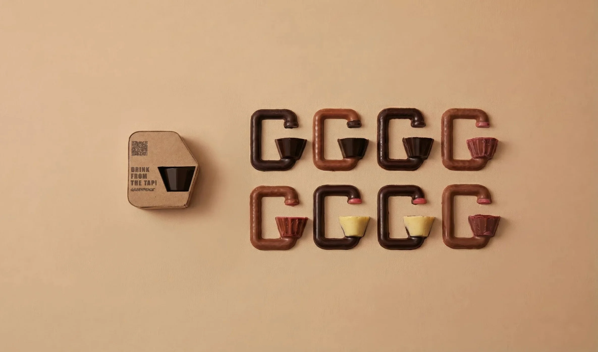
Drink from the tap!
Designing a Campaign Snack for Greenpeace
The theme for this project is to promote a Greenpeace campaign by designing a small snack that could be distributed in a big event.
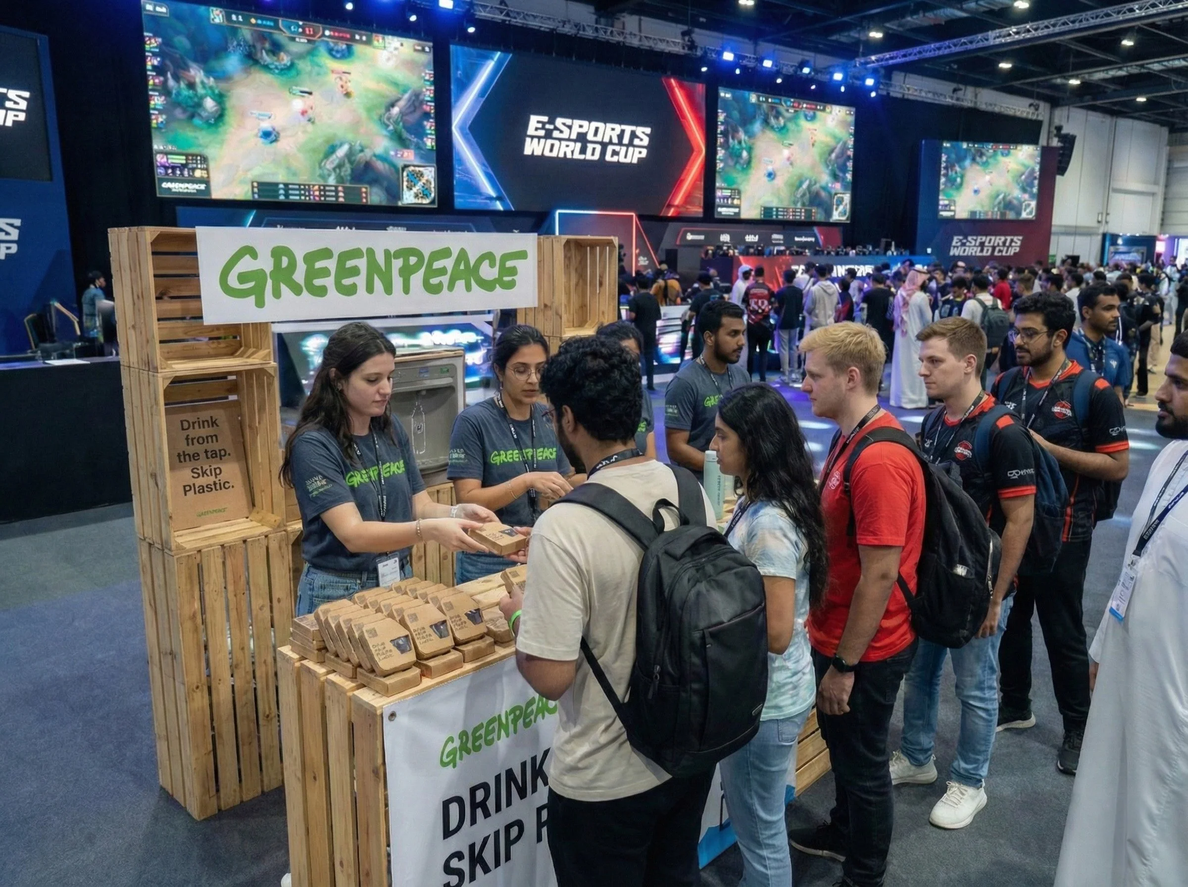
The campaign Greenpeace wants to promote is to ‘have more people drink water from the tap instead of buying water in a plastic bottle.’ Greenpeace will distribute small, designed chocolates to the audience at an event to spread the message. The given location for me to promote the idea is at the Game Fair.
Cient: GREENPEACE
Greenpeace is a non-governmental environmental organization with offices in over 39 countries and an international coordinating body in Amsterdam, the Netherlands.
Greenpeace states its goal is to “ensure the ability of the Earth to nurture life in all its diversity and focuses its campaigning on worldwide issues such as climate change, deforestation, overfishing, commercial whaling, genetic engineering, and anti-nuclear issues.
AI-Generated Image
Drink from the tap! - A Greenpeace campaign
Designing a snack to spread the message
This project promotes a Greenpeace campaign through the design of a small snack distributed at a large public event. In partnership with Design Academy Eindhoven, the campaign encourages people to drink tap water instead of buying bottled water in plastic containers, using thoughtfully designed chocolates as a tangible way to spread the message.
The campaign is set within major offline game fairs such as the E-Sports World Cup and Gamescom, where large and diverse audiences gather. These settings were chosen to reach a broader public beyond traditional environmental contexts.
Partnership
Location
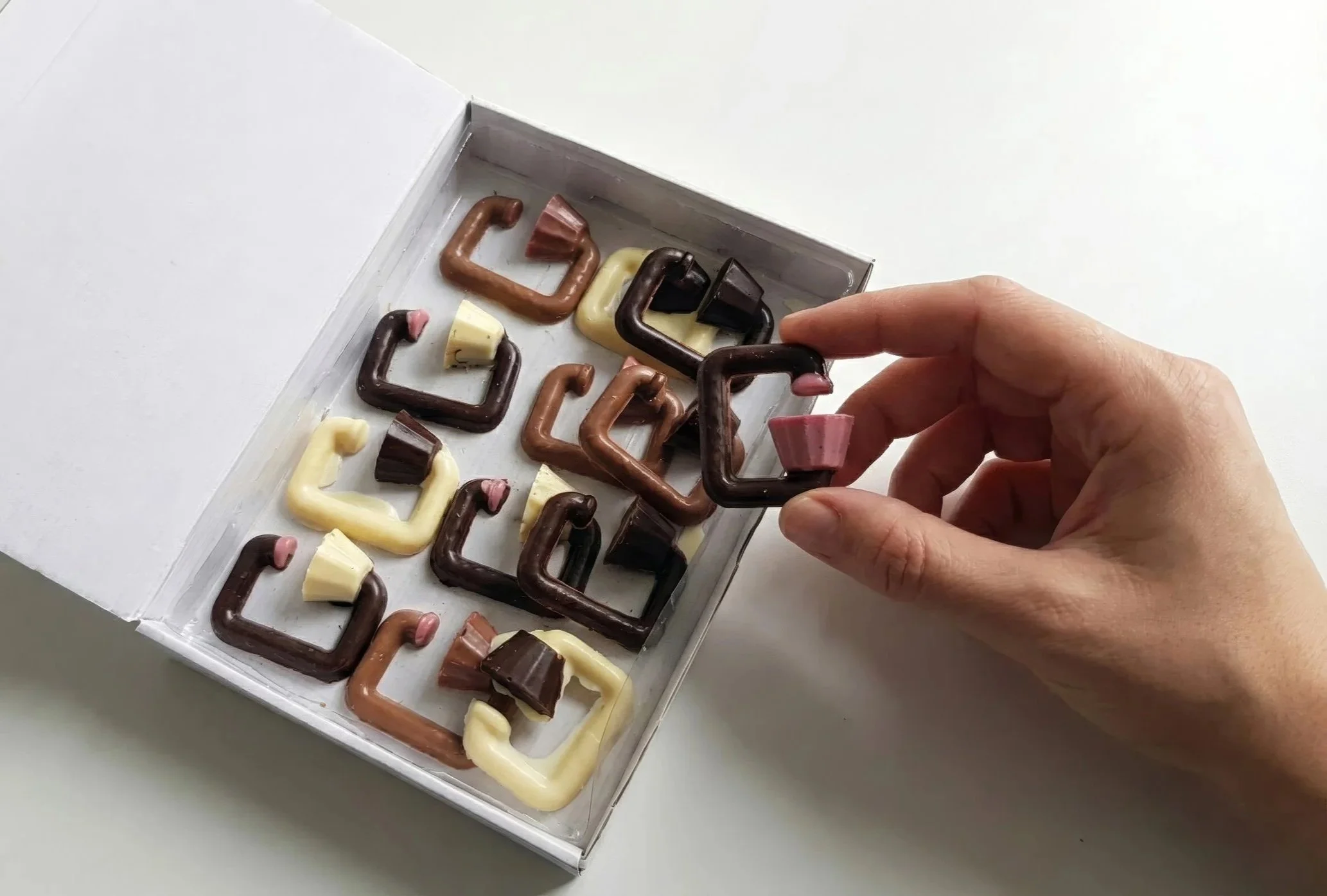
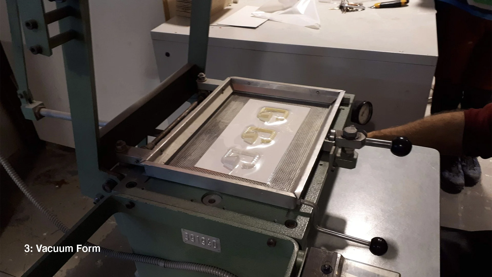
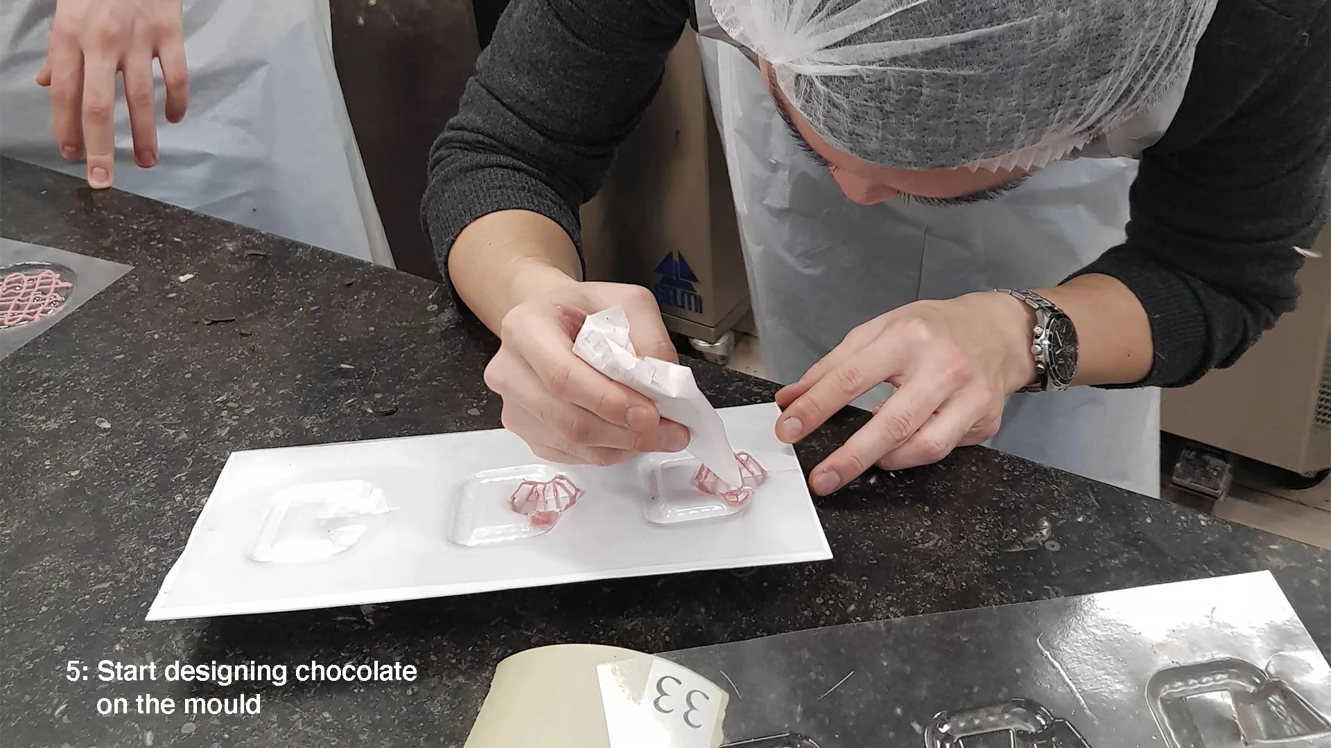
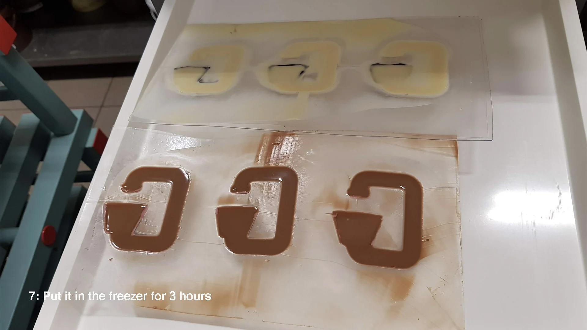
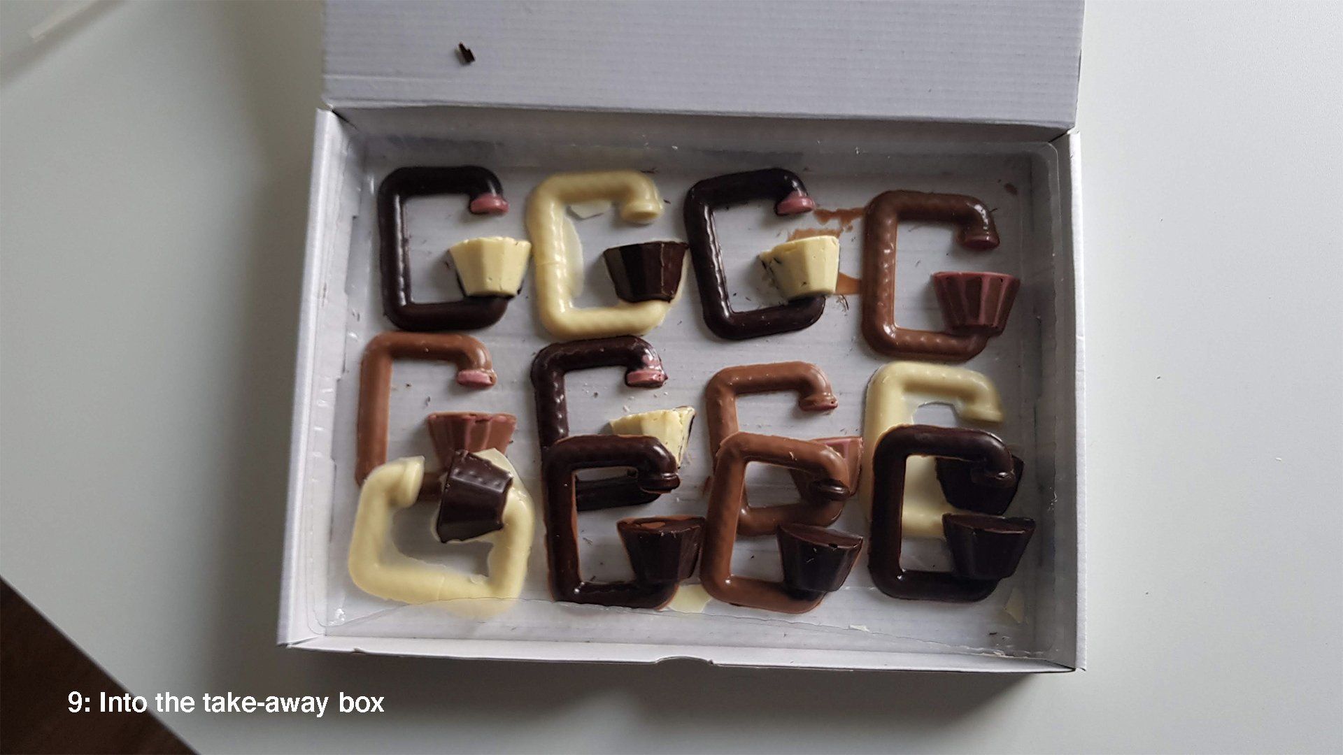
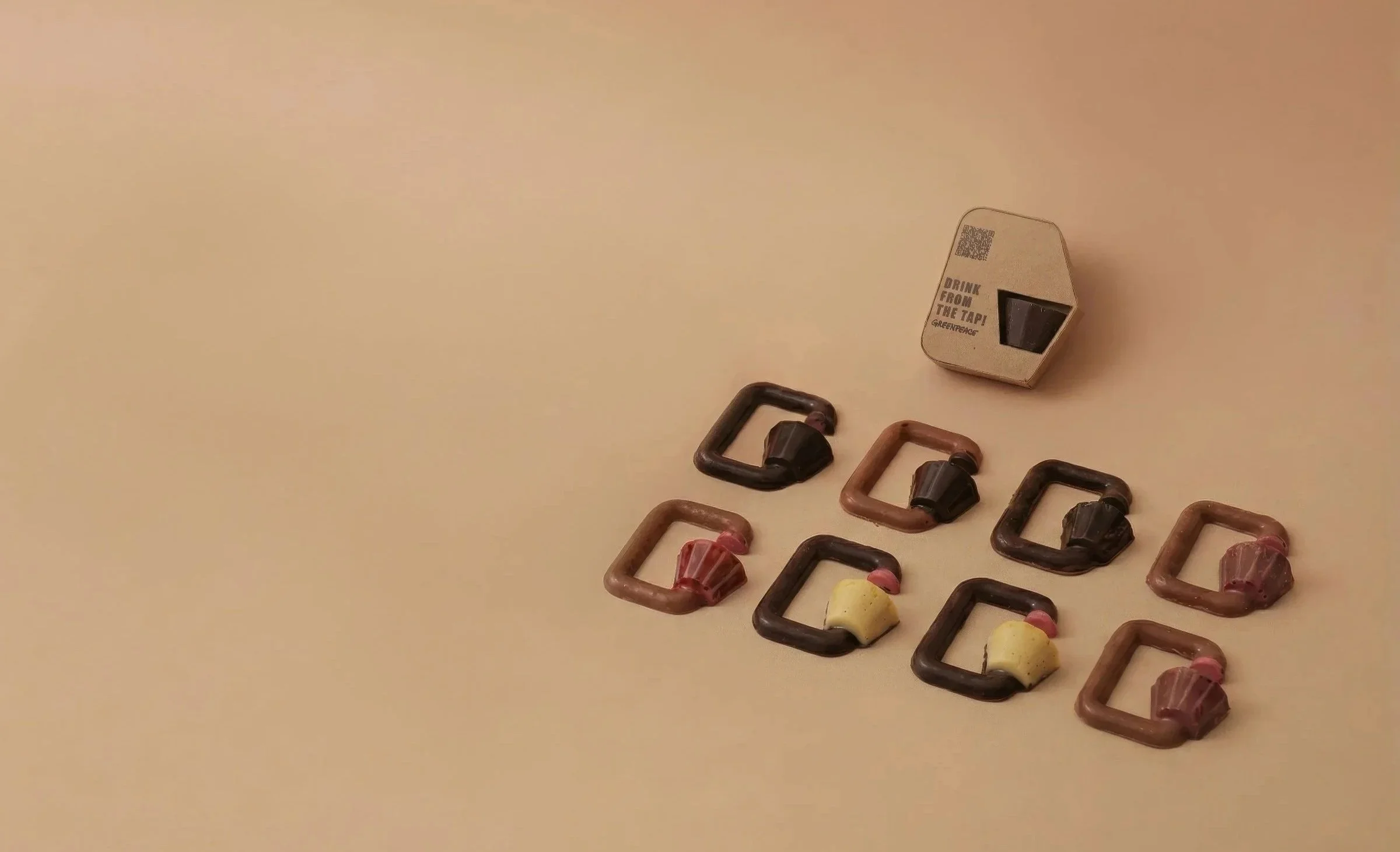
Designing Chocolate
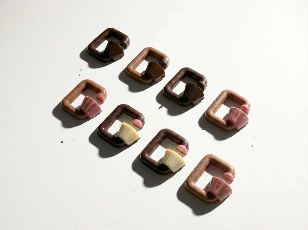
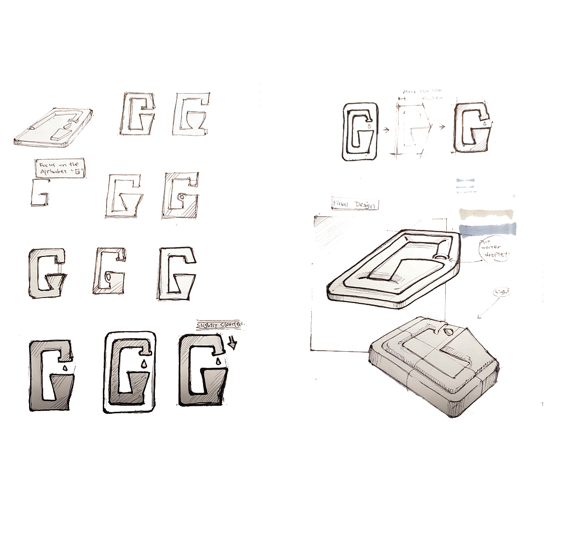
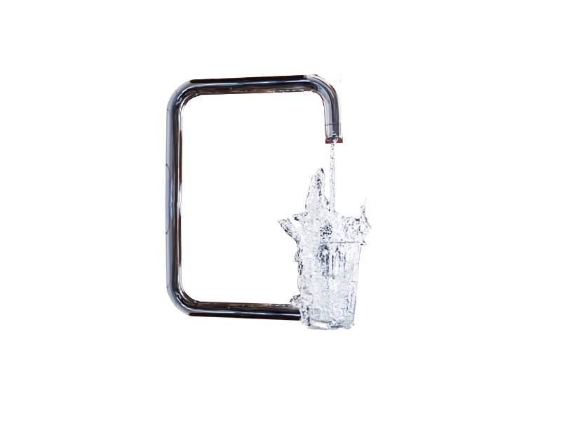
Alphabet ‘G’ From ‘Game fair’ and ‘Greenpeace
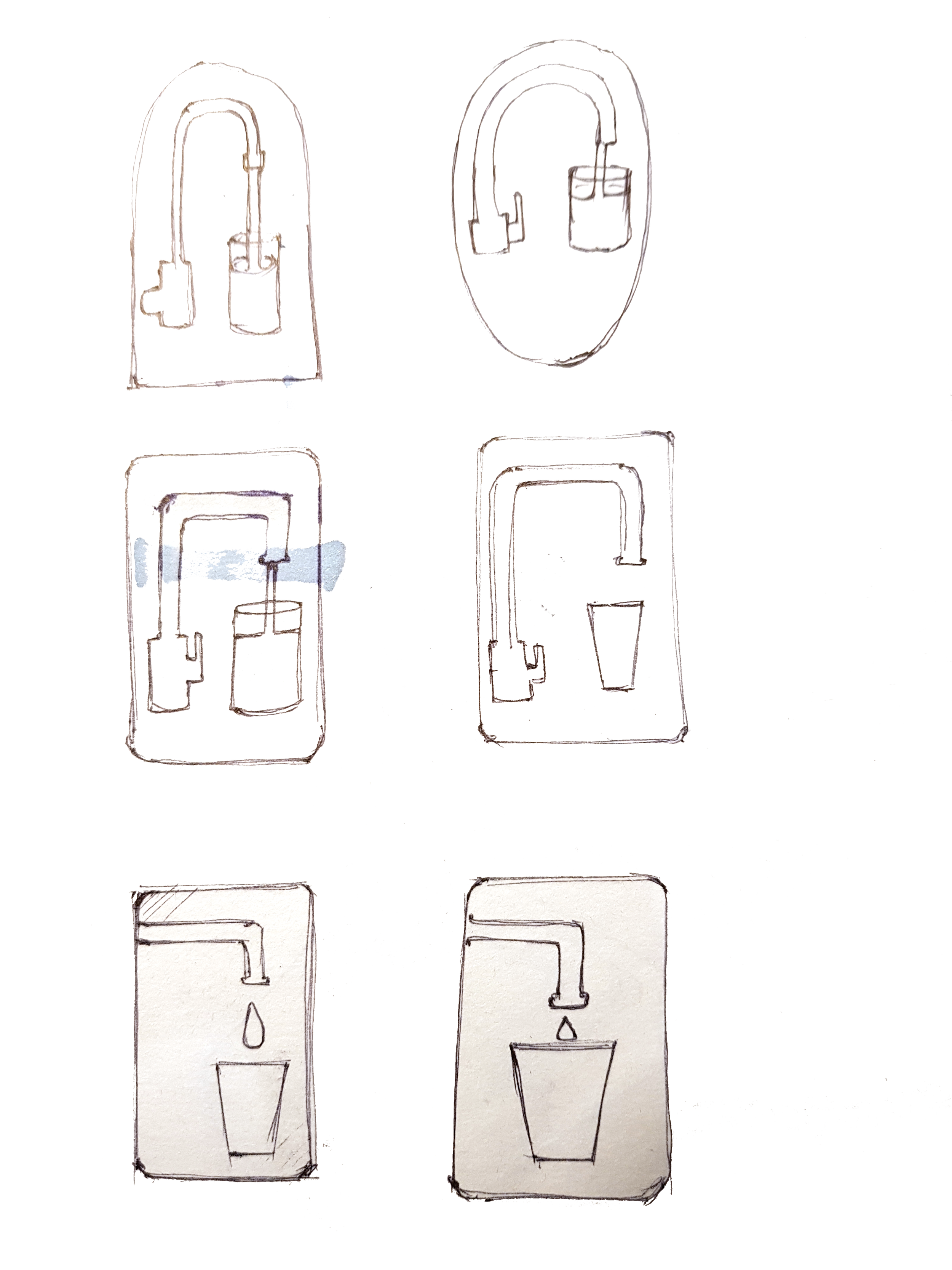
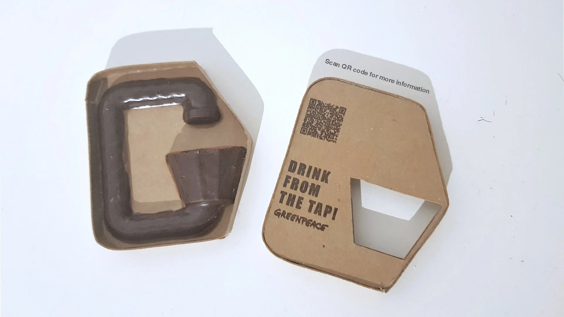
To communicate the message of drinking tap water, I used the letter “G” as the main design inspiration. The letter comes from the first letter of both “Game Fair” and “Greenpeace,” connecting the campaign context with the organization. I chose “G” for its versatility in shape and its potential for abstraction. The initial sketches and renders show the upper part of the letter as a water tap and the lower part as a cup that holds water.
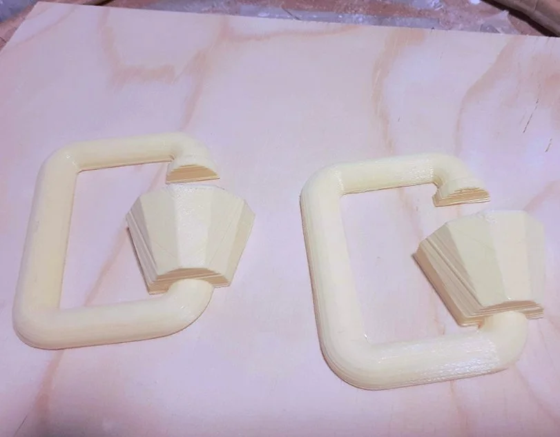
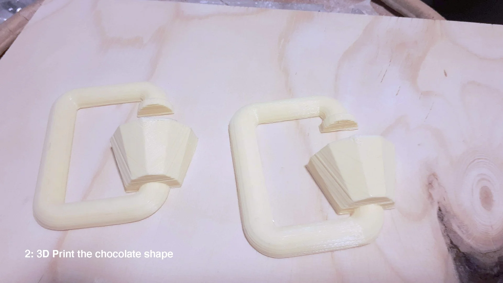
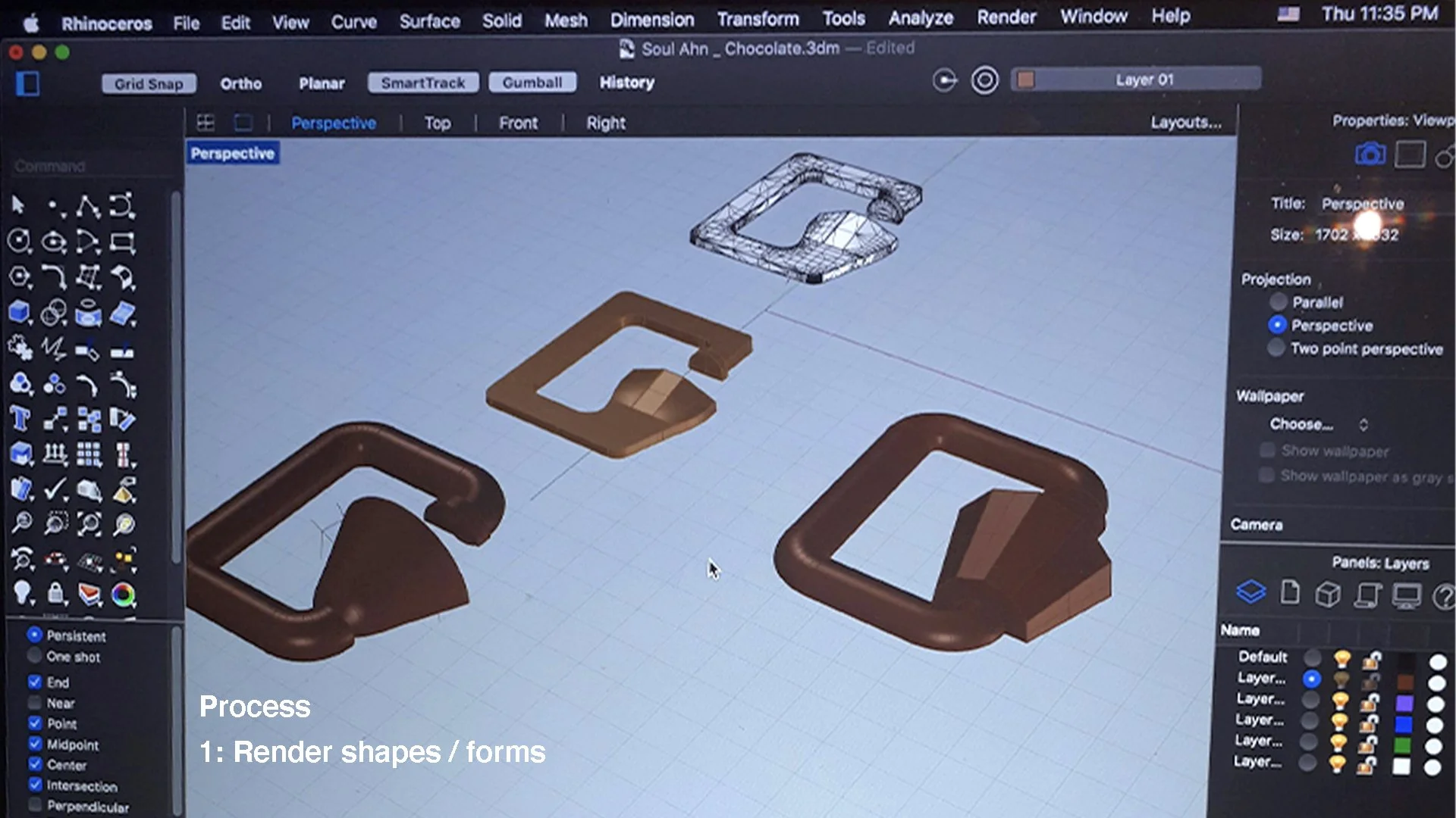
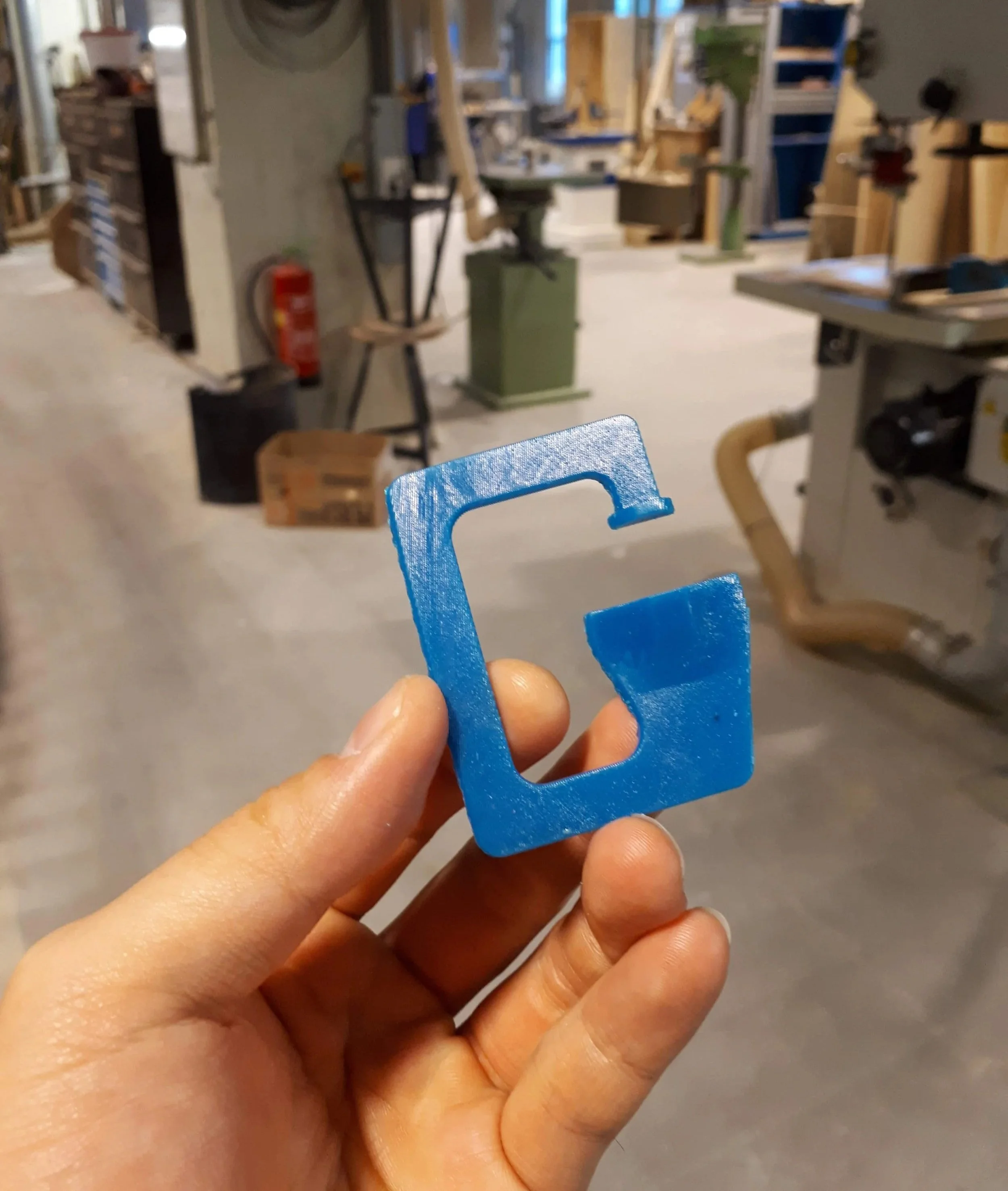
1. 3D Print the Final Chocolate Design Model
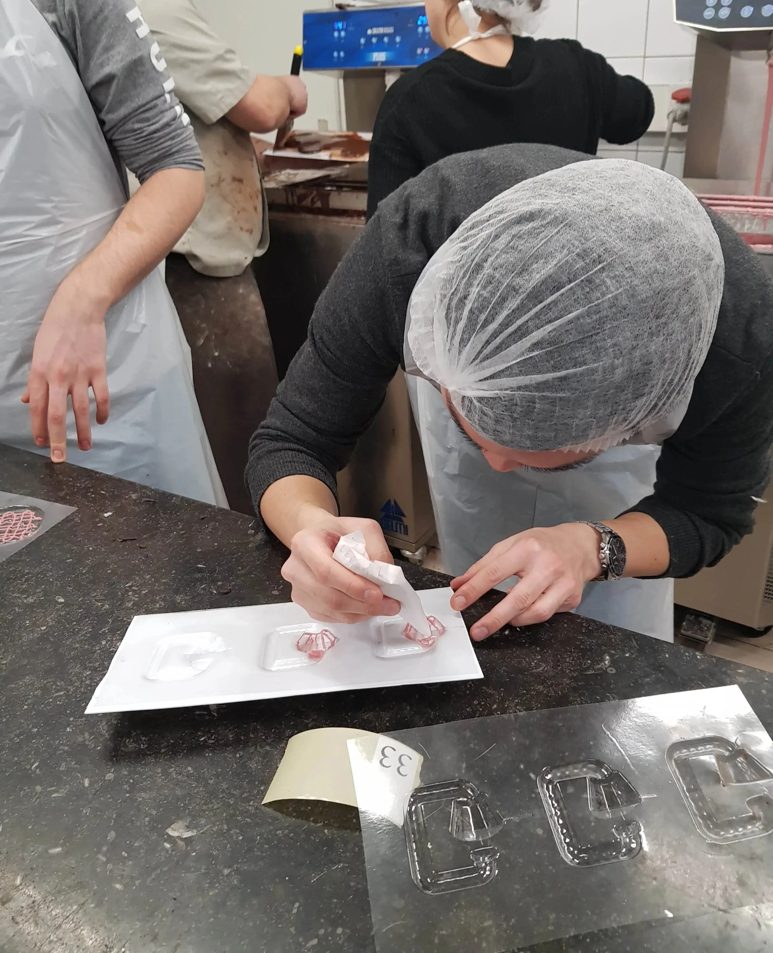
3. Visit to a Chocolate Factory in Belgium for Production
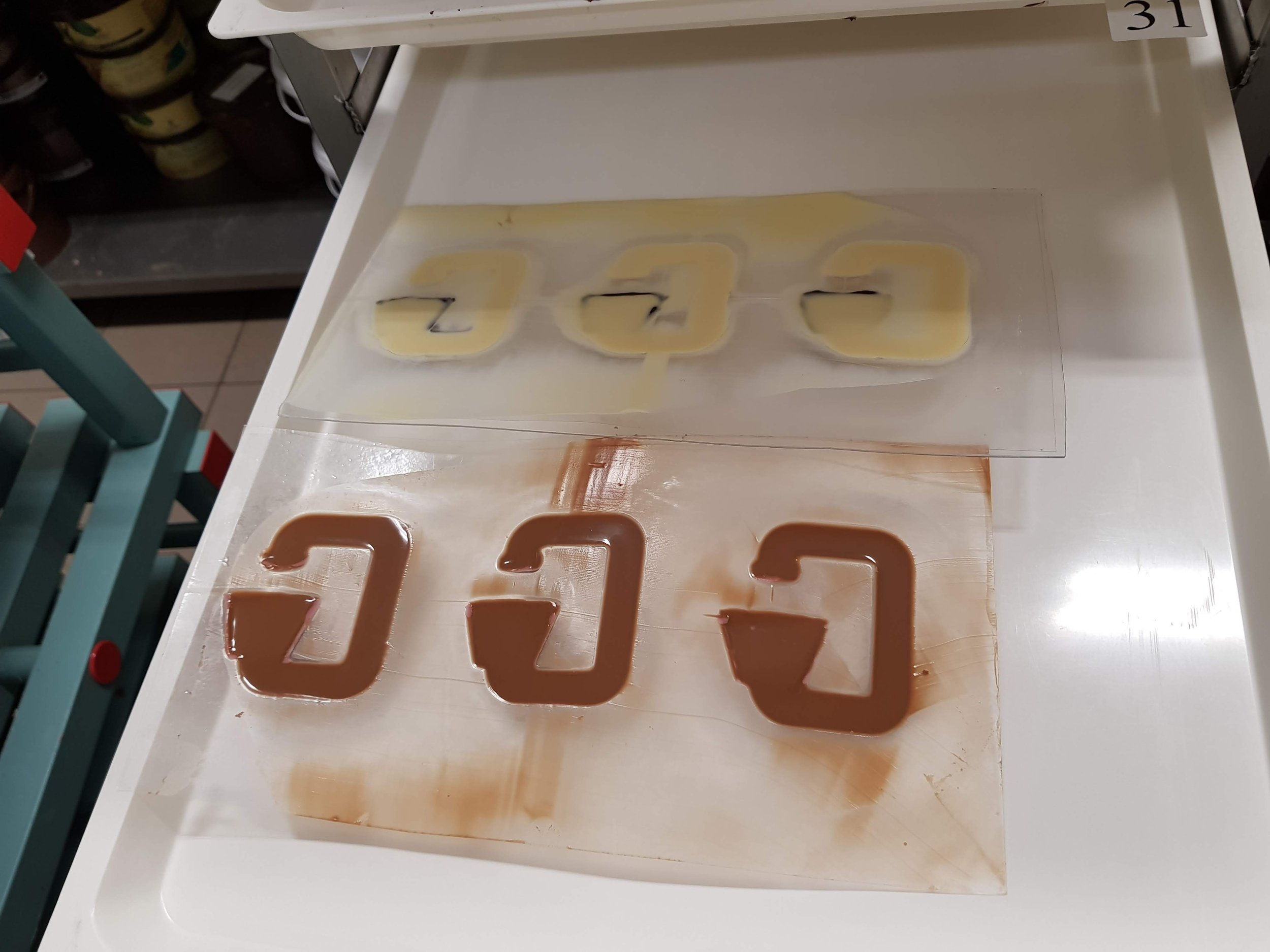
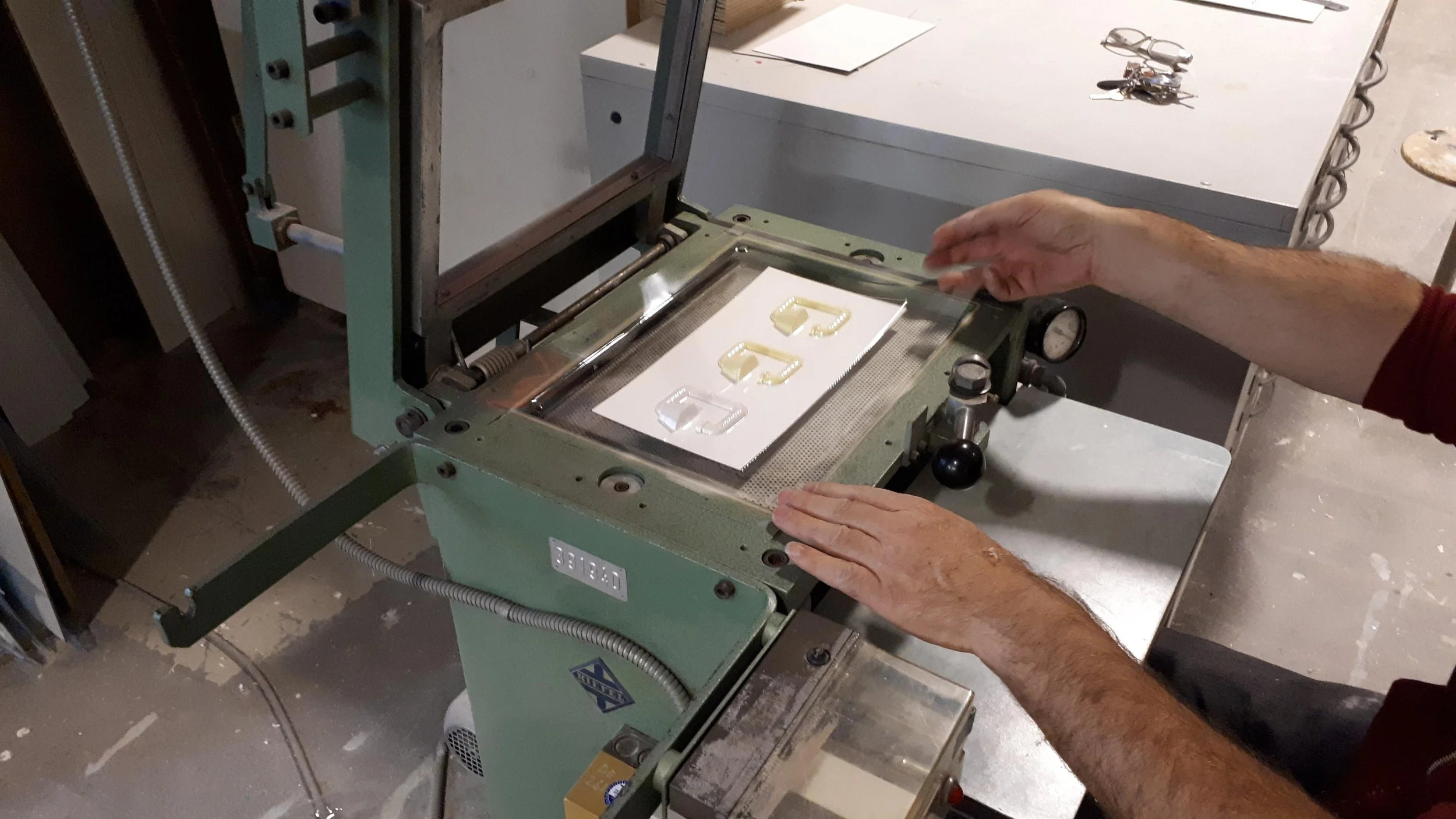
2. Vacuum forming a mold using the prototype
4. Chocolates + mold in the freezer for 3 hrs
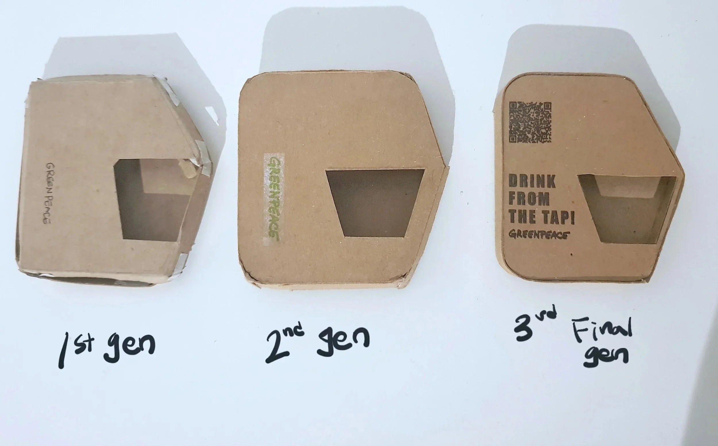
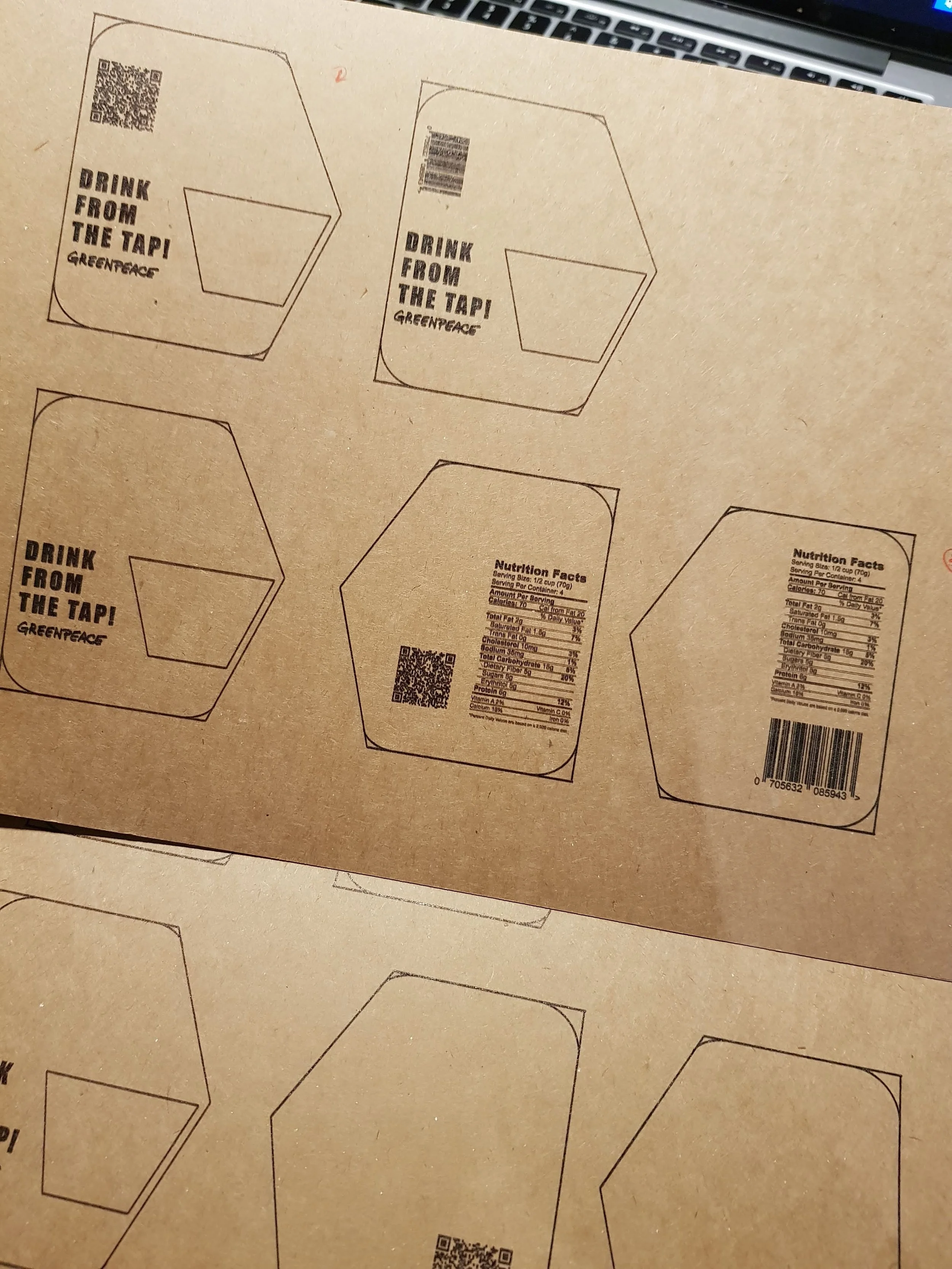
5. Design packages for the chocolate
6. Store the chocolates